Entrepreneurs, creators, engineers, innovators, working towards a better model for private education
The Senior Project is a selective program that involves an off-campus research project or internship of the students’ choice. Students select a faculty member as their advisor and work with a mentor at their research site. They create detailed project plans, bibliographies of resources, and a personal syllabus for their projects, all of which is approved by a committee of teachers and administrators. To remain connected to their school community while in the field, students are required to blog throughout their experience. At the end of the trimester, students return to campus and present an analysis of their findings to peers, staff, and parents.
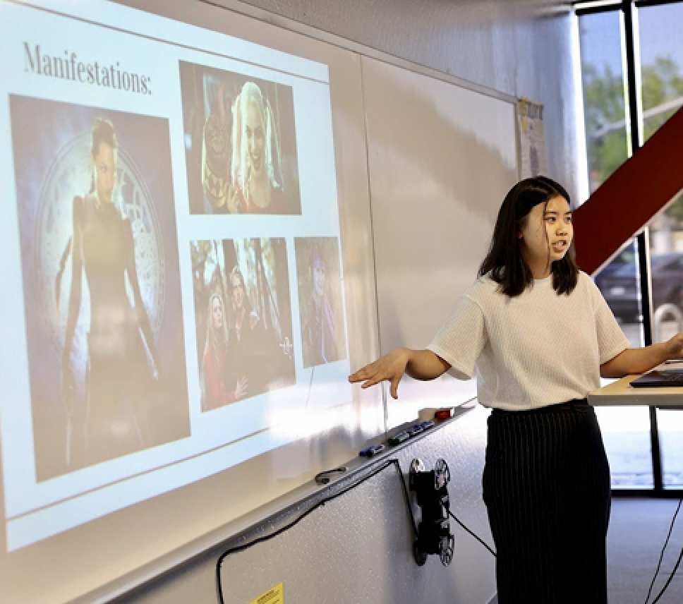
AP Research
As an alternate to the Senior Projects, other students may choose to complete the College Board’s AP Capstone program.